I am finally closer to the answer to a question why some layouts, which basically have a minimum of elements, look so balanced and harmonized when they have so many white spaces. This is an example where there are an object with some text and nothing more. When I played like that, it looked empty and unfinished because I was placing the object to the actual center of a layout not knowing that it is not a visual center.
Getting the balance while organizing visual elements of a layout is a crucial part of design process. There is a one rule that helped achieving balance and harmony through the history of paintings, architecture, sculpting, photography and design. It originates from ancient Greeks where mathematical proportions of a human body were a base of harmonious measurements. This mathematical rule is known as a Golden rule or Golden Ratio. Two quantities are in Golden ratio if the ratio of their sum and larger quantity is equal to the ratio of larger quantity and the smaller quantity.
Golden Ratio also had a historical use in art in order to create a visual harmony. Jan Tschichold, book designer and typographer, considered as a pioneer in applying modern style to typography, used Golden Ratio as a guide for his clean and timeless design, drawing on medieval book design.
The easiest way to follow Golden Ratio is through the Rule of Thirds. Layout should be divided into both horizontal and vertical thirds which together form nine sections. The four places where the lines are intersected are main points of attention which means that the most important object should be placed around those points rather than in the center. Below is a good example of using this rule. Two out of four intersections contain the most important information.

I also collected some magazine pages, magazine advertisements, photographs in order to test this rule. I decided to take a quick look at the page in order to see which elements I spotted first and then I am going to test whether it is associated with rule of thirds.

This is a simple page from Computer Arts magazine which contains a text on a left hand division while a photo of colorful donut on a central to right hand divisions and lays on lower intersections. This is a simple but striking compositions where the photo is a key point of attention and together with a white text and violet background creates a good visual dynamic.

This is also a page from Computer Arts magazine; it is actually an advertisement for a new model of camera. Main focus is on text in white box which lays on a upper intersections of the lines, and on a second one which, along with camera, is positioned near the lower intersections of the lines. Those three elements are in main focus, created to quickly draw attention of a viewer.

This is a vivid colorful cover of a Computer Arts magazine with many elements; however two of them caught my eyes in a moment. The title of magazine placed in upper left corner near the intersection of first horizontal and vertical lines. It is bold distinctive on a white contrasting background in a form of circle. The other element is The designer's cookbook that is also placed around the lower points of intersections which put it at forefront f a cover. The lower horizontal line passes through the teaser about Sagmeister which is also near the lower left point of lines intersection. In the lowest right hand third is teaser for The design manual. The big illustration of a man who is reading book is on a central to right hand section.


This is an advertisement for a Chopard Jewelry where the watch and diamond rings are placed around lower right lines intersection which make them notable on a first sight, but the other main focus is on camera which is held by a woman because it lays on a upper right lines intersection. I thought they somehow combined technology with diamonds. Jewelry on her wrist is less notable.


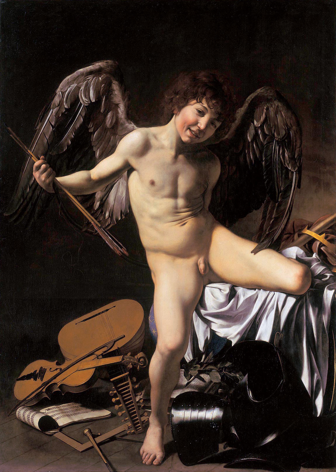
Applying the Rule of Third can be notable here on this famous artwork called Love Conquers All created by famous Italian baroque artist Caravaggio. The painting shows Amor, a Roman Cupid with eagle wings who stands in front of symbols of human endeavors such as violin, manuscript, and compasses. This composition in its harmony also follows the Rule of Third. Boy’s head and wings are in upper part in a dark background, while violin and other items are on the lower left third which creates a good balance. He also put a focus on a right hand section where he placed white sheet with bay leaves, and coronet. He portrayed all elements in such a level of realism that I have a feeling this is all alive.