I like this stationary design because of its simplicity and soft colors. Good logo design plays a major part here so plenty of whitespace only draws attention to it and makes it more outstanding. I also like 3D design and material.
This letterhead design is very authentic and has that vintage sense along with its logo. It works very well together.
I have chosen this brand identity for its limited color palette and good use of whitespace. I really like logo which is so effective and smart so I guess it is not hard to do a good job with brand identity when you have a good logo.
This one I like the most. I love every element as a part of this design starting from this cute logo with good typographic dynamic. I also love color combination that is so well harmonized I love how it was all developed further through all stationary.
This is clean design with limited color palette which was combined in a way that it achieved good visual effect. We can see how all three different business cards work good using the same color combination in different way. Logo works equally well on black and white.
I like this sophisticated design that uses two contrasting colors that creates good dynamic. I like all elements as it all works well both on white and maroon.
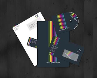
I like these neon stripes on dark background, I think it is interesting, modern and visually appealing. I am not used to see dark envelopes but I like it as change.
White background can be very effective with this colorful and vivid border so this design doesn’t require much additional elements.
Envelop from this brand identity is what caught my eyes. I like how it is divided onto thirds and I like achieved contrast. All elements have needed consistency.
This is simple classic two-color brand identity design that works fine. I love it in all variations.
Source:
http://www.youthedesigner.com/2011/08/31/45-beautiful-letterhead-designs-for-inspiration/


No comments:
Post a Comment